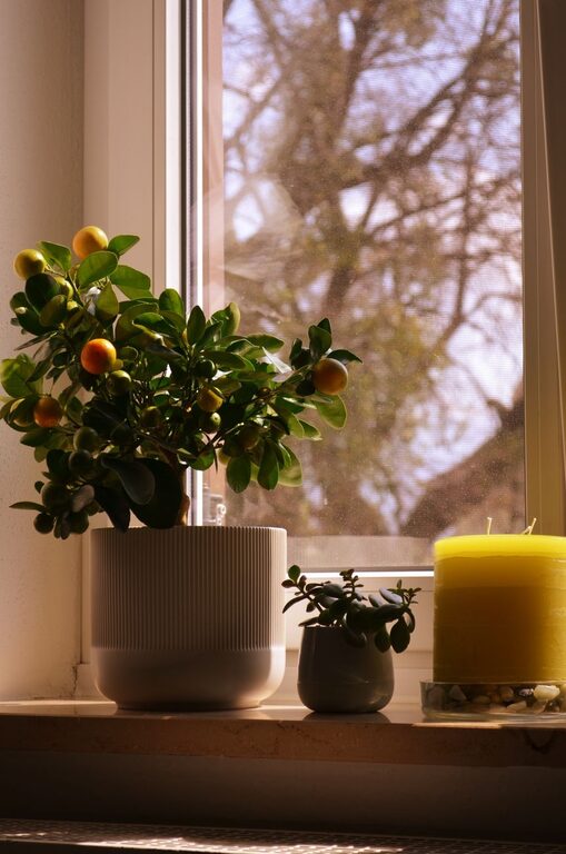

Creating a calm and peaceful atmosphere in your home can greatly improve your overall well-being. One of the simplest yet most impactful ways to achieve this is through your choice of colors. Calm colors help evoke a sense of tranquility, reduce stress, and make your living space feel inviting and restful. If you’re planning to refresh your home’s look or simply want to create a soothing environment, here are some helpful tips for choosing calm colors.
Why Choose Calm Colors for Your Home?
Calm colors—often soft, muted tones—are known to promote relaxation and comfort. They can make rooms feel more spacious and less chaotic, providing a mental break from the fast pace of daily life. Unlike bold or bright colors, calm colors tend to have a subtle effect on mood, making them perfect for bedrooms, living rooms, or any space where you want to unwind.
Understanding the Basics of Calm Colors
Before picking your palette, it helps to know what types of colors are generally considered calm:
– Neutrals: Soft whites, beige, taupe, and gray are timeless and versatile. They create a neutral backdrop and promote peacefulness.
– Pastels: Light shades of blue, green, lavender, and pink can add a gentle touch of color without overwhelming the senses.
– Earth Tones: Warm browns, muted greens, and soft yellows connect the indoors with nature, fostering a grounded feel.
– Cool Blues and Greens: These colors often remind us of water and nature, creating a sense of calm and relaxation.
Tips for Choosing Calm Colors
1. Consider the Purpose of Each Room
Think about how you use each room and what mood you want to create. Bedrooms benefit from soft blues or lavender, which encourage restfulness. Living rooms might incorporate light greens or warm neutrals to foster calm socializing. Home offices can use muted blues or grays to support focus without feeling stressful.
2. Test Colors with Lighting in Mind
Colors can appear very different depending on natural and artificial light sources. Always test paint samples on your walls and observe them at different times of the day. South-facing rooms tend to have warm light, which can make colors look brighter. North-facing rooms get cooler light, often making colors look more muted or blueish.
3. Start with a Neutral Base
A neutral color on the walls can be an excellent foundation for calmness. From there, you can add accent colors in soft shades through furnishings, pillows, rugs, or artwork. Neutrals also make it easier to switch out accessories if you want a fresh look later.
4. Use Color Psychology as a Guide
Certain colors are linked to specific emotional responses. For example:
– Blue: Often associated with trust, calm, and serenity.
– Green: Symbolizes balance and refreshment.
– Lavender: Relaxing and gentle, it encourages rest.
– Beige and Gray: These neutrals evoke simplicity and stability.
Use this knowledge to choose colors that support the mood you want in each space.
5. Balance Color Intensity
Avoid overly saturated or very dark colors in rooms meant for relaxation, as these can feel too intense or heavy. Instead, opt for softer hues with a hint of color. For example, a pale mint green instead of bright lime or a light dusty blue instead of navy.
6. Incorporate Texture and Layers
Color alone doesn’t create calmness; texture and layering add depth and interest to your space. Consider fabrics like linen, cotton, or wool in your chosen color palette to enhance the overall soothing effect. This approach also avoids monotony and makes the space feel cozy.
7. Use Nature as Inspiration
Look outside for inspiration. Natural landscapes offer countless examples of calm color schemes—from sandy beaches and leafy forests to soft sunrises and cloudy skies. Bringing these elements indoors through your color choices helps create a harmonious environment.
8. Don’t Forget About Ceiling and Trim Colors
Calm doesn’t just apply to walls. Paint ceilings and trim in colors that complement your main palette. Often, a subtle off-white or pale shade is perfect to keep the look unified and airy.
Common Calm Color Combinations
Here are a few calming color palettes to consider:
– Soft Blue and Cream: Perfect for bedrooms or bathrooms.
– Muted Sage Green and Warm Beige: Brings an earthy, welcoming feel to living rooms.
– Lavender and Light Gray: Ideal for quiet nooks or reading corners.
– Pale Pink and White: Adds a subtle softness to nurseries or guest rooms.
– Light Taupe and Dusty Blue: Works well in home offices or study areas.
Final Thoughts
Choosing calm colors for your home is a wonderful way to create a relaxing sanctuary that supports your mental well-being. By keeping your color choices soft, natural, and purpose-driven, you can transform any room into a peaceful retreat. Don’t rush the process; take your time testing colors and adding layers until the space feels just right for you.
Remember, your home should reflect what makes you feel calm and happy—so trust your instincts and enjoy the journey toward a more tranquil living space.